Simple Tips To Improve The Look And Feel Of Your Levels
Posted: May 28th, 2014, 4:21 pm
For those of you that have been around for a little longer and recognize this from somewhere, yes, I've seen it, I just can't find it on
YouTube anymore and this is just my take on it.
I'm not a great writer, so please bear with me as I try to explain what's going on in my head.
.
Every once in a while, I browse through Atmosphir's level pages and stumble upon a level that looks kinda similar to this:
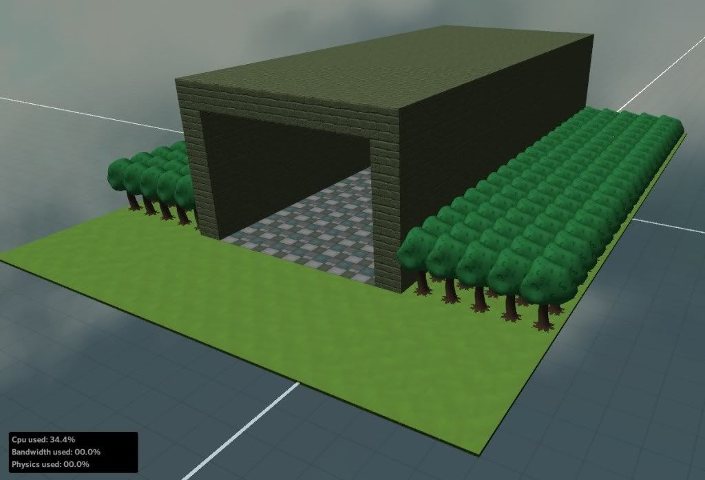
Now, while this is better than some levels I've seen, it's nowhere near LOTD-status. Imagine if you'd buy a video game, you take it home, you play a level/stage and suddenly you're presented with this big, empty hall with nothing in it and a buttload of trees planted as regular as possible.
.
You would throw the game out the window, right? Large chunks of nothing aren't very nice to look at.
.
It's the same in Atmosphir. Better looking levels receive more positive feedback.
.
But how do you make it look better? Well, let's start with the crap-load of trees outside. The way the trees are placed above is just far too regular to appear anywhere in nature. The trees are spaced exactly the same, and all are exactly the same height. Let's change that:
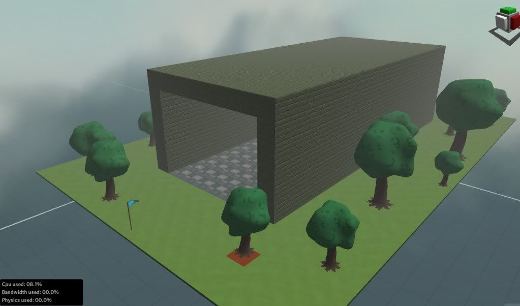
By placing the trees irregularly and varying the scale, you can create a forest that is similar to what you would find in real life. A nice side effect is that the capacity bar now gives you more room for all your traps and puzzles. You can also add other props to the scenery to further add diversity, but don't overdo it.
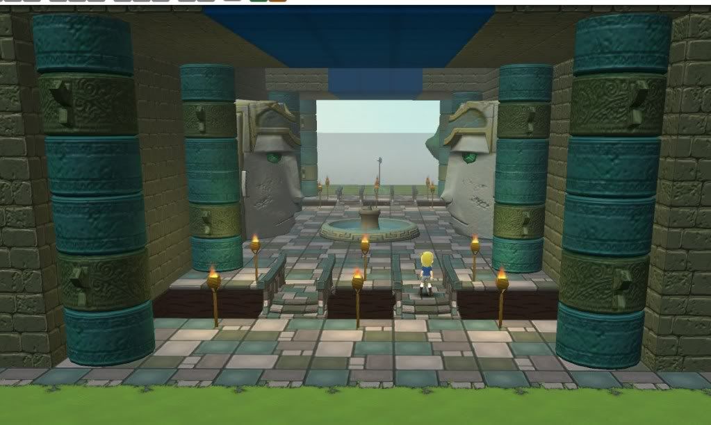
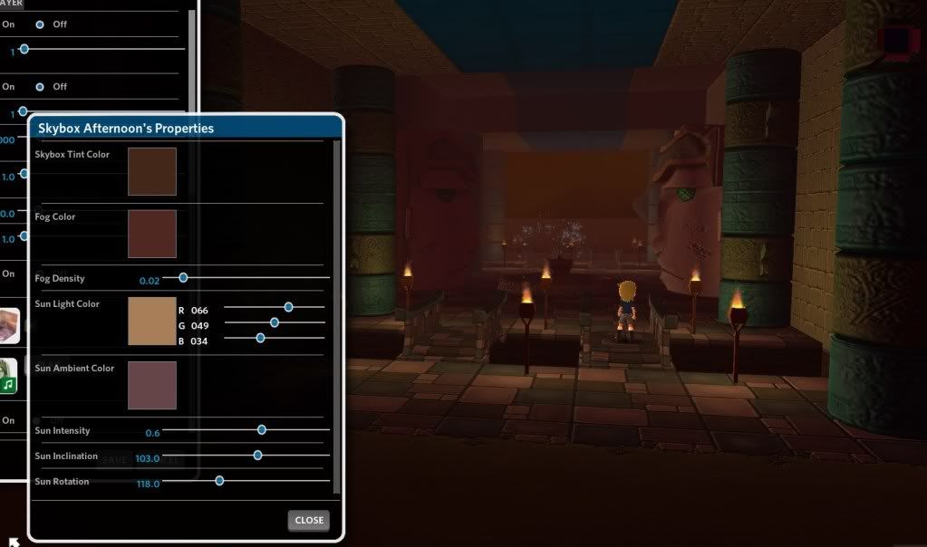
Now onto the hall. Again, props are used here to add detail, but lots of things can be done using just blocks and floors. Notice how the floor tiles are aligned in a pattern, and bridges cross over chasms in the ground. The last thing would be to adjust the skybox to your liking. A great level can benefit a lot from a fitting background and feeling, so choose carefully.
.
Next time you design a level, consider these steps. Do I really need that many trees in here? Maybe spread them out more? How am I going to make this hallway look good? How should the level feel? Do skybox and music reflect that?
One last really important tip:
Listen to what other people say about your level.
There is a fine line between criticism and bashing. Most peeps on here do try leave criticism though, and it's your job as designer to listen to them. Learn to take criticism.
If people say "Wow, that owl spike trap is so OP, make it spin less fast", don't tell them right away how bad they are at playing the game. Go back into your level, test the spike trap, see if it's really as hard as they say. If it is, change it. If it isn't that hard FOR YOU, tell them that. BUT DO NOT BASH THEM.
Same goes for the environment. If people say "that just looks bland", go back to your level, and assess it from a neutral point of view.
.
If you have more suggestions for designers, leave them down below.
YouTube anymore and this is just my take on it.
I'm not a great writer, so please bear with me as I try to explain what's going on in my head.
.
Every once in a while, I browse through Atmosphir's level pages and stumble upon a level that looks kinda similar to this:
Now, while this is better than some levels I've seen, it's nowhere near LOTD-status. Imagine if you'd buy a video game, you take it home, you play a level/stage and suddenly you're presented with this big, empty hall with nothing in it and a buttload of trees planted as regular as possible.
.
You would throw the game out the window, right? Large chunks of nothing aren't very nice to look at.
.
It's the same in Atmosphir. Better looking levels receive more positive feedback.
.
But how do you make it look better? Well, let's start with the crap-load of trees outside. The way the trees are placed above is just far too regular to appear anywhere in nature. The trees are spaced exactly the same, and all are exactly the same height. Let's change that:
By placing the trees irregularly and varying the scale, you can create a forest that is similar to what you would find in real life. A nice side effect is that the capacity bar now gives you more room for all your traps and puzzles. You can also add other props to the scenery to further add diversity, but don't overdo it.
Now onto the hall. Again, props are used here to add detail, but lots of things can be done using just blocks and floors. Notice how the floor tiles are aligned in a pattern, and bridges cross over chasms in the ground. The last thing would be to adjust the skybox to your liking. A great level can benefit a lot from a fitting background and feeling, so choose carefully.
.
Next time you design a level, consider these steps. Do I really need that many trees in here? Maybe spread them out more? How am I going to make this hallway look good? How should the level feel? Do skybox and music reflect that?
One last really important tip:
Listen to what other people say about your level.
There is a fine line between criticism and bashing. Most peeps on here do try leave criticism though, and it's your job as designer to listen to them. Learn to take criticism.
If people say "Wow, that owl spike trap is so OP, make it spin less fast", don't tell them right away how bad they are at playing the game. Go back into your level, test the spike trap, see if it's really as hard as they say. If it is, change it. If it isn't that hard FOR YOU, tell them that. BUT DO NOT BASH THEM.
Same goes for the environment. If people say "that just looks bland", go back to your level, and assess it from a neutral point of view.
.
If you have more suggestions for designers, leave them down below.
